Highlights
Released 2 versions so that native users aren't overwheled by so many changes.
My Role
UX Researcher & Designer — collaborated cross-functionally with Development and Marketing teams
Timeline
May 2024 (4 weeks)
Project Deliverables
User Research
UI Design
Design Thinking
Methodologies
Figma
ChatGPT
Miro
HubSpot
Client
Nimbus Healthcare
Project Overview
Redesigned the Nimbus care portal to simplify health plan tracking, appointment scheduling, and medication management for middle-aged users.
The Challenge
Nimbus’ customers — especially those enrolled in the WeightWise program — struggled to:
• Track their personalized care plans
• Manage appointments and medication refills
• Understand their program milestones and next steps
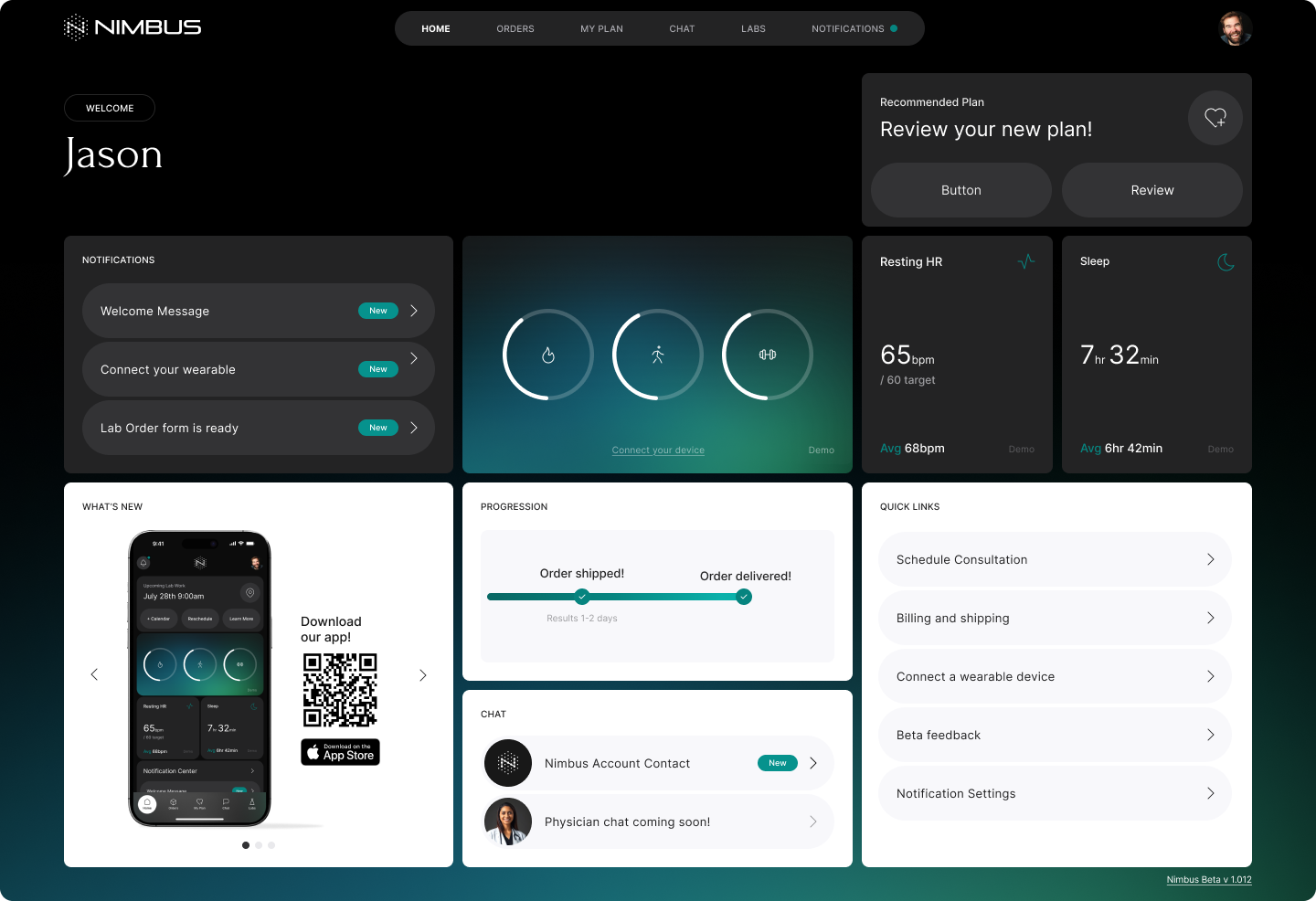
The existing portal was information-heavy, fragmented, and didn’t reflect the emotional and cognitive needs of users on a long-term health journey.
As a result, the support team received a high volume of repetitive queries about basic tasks — from locating their care plan to rescheduling appointments — signaling a clear breakdown in self-service usability.
Business Goal
Reduce churn and improve subscription retention by transforming the portal into a supportive, self-guided experience that empowers users and reduces dependency on support.
User Research
To understand the usability gaps and inform our design decisions, we conducted both quantitative and qualitative research.
Methods
• Analytics deep dive (desk research): Identified task drop-offs and analyzed mobile vs. desktop usage patterns
• User survey: Gathered feedback on overall satisfaction and perceived barriers
• User interviews: Conducted 6 semi-structured interviews, including:
- 3 WeightWise users
- 1 Nimcore user
- 2 internal admin users (support and operations)
Key Insights
• Users often felt lost navigating the portal, especially among older age groups, leading to significant task drop-offs
• The portal auto-billed users without clear notifications, creating confusion and distrust
• Rescheduling appointments or requesting refills was frustrating and unintuitive, especially when accessed on mobile
• Over 70% of users accessed the portal primarily via mobile, yet key flows weren’t optimized for smaller screens
Problem Statement
Despite subscribing to structured programs like WeightWise and Nimcore, patients struggled to access relevant information, manage appointments, and track their care plans independently. These friction points not only impacted user satisfaction but also led to high support volume and risked early churn.
How Might We…
Help patients easily access and manage their care plans in a way that builds trust, reduces interface clutter, and supports long-term engagement with their health journey?
Ideation & Strategy
To address the confusion and friction users experienced while navigating their care journey, we focused on redesigning the “My Plans” flow — a critical section where users accessed their active medication protocols and upcoming steps.
Legacy Design: Confusing Terminology and Visual Clutter
In the original portal, this section was labeled “Recommendations”, which created ambiguity. Users often misunderstood it as optional suggestions rather than essential care plans. The layout lacked hierarchy and actionable cues, resulting in user confusion and frequent support queries.
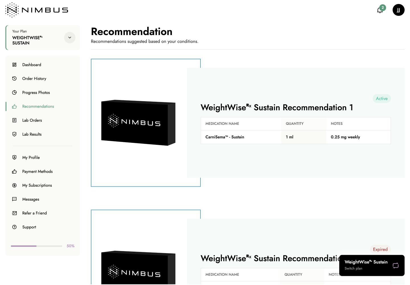
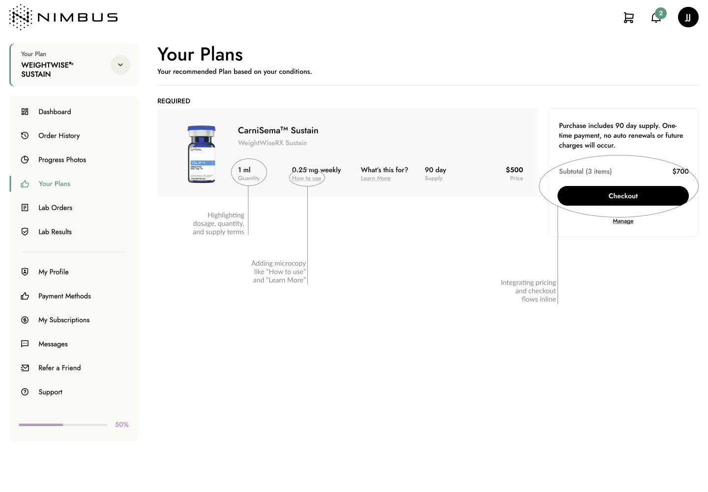
Version 1: Renaming & Structural Optimization
To quickly improve clarity and reduce support dependency, we introduced a terminology update by renaming “Recommendations” to “My Plans”. This aligned better with users’ expectations and gave a sense of ownership.
Other improvements included:
• Highlighting dosage, quantity, and supply terms
• Adding microcopy like “How to use” and “What’s this for?”
• Integrating pricing and checkout flows inline
• Keeping the visual layout consistent to reduce disruption for existing users
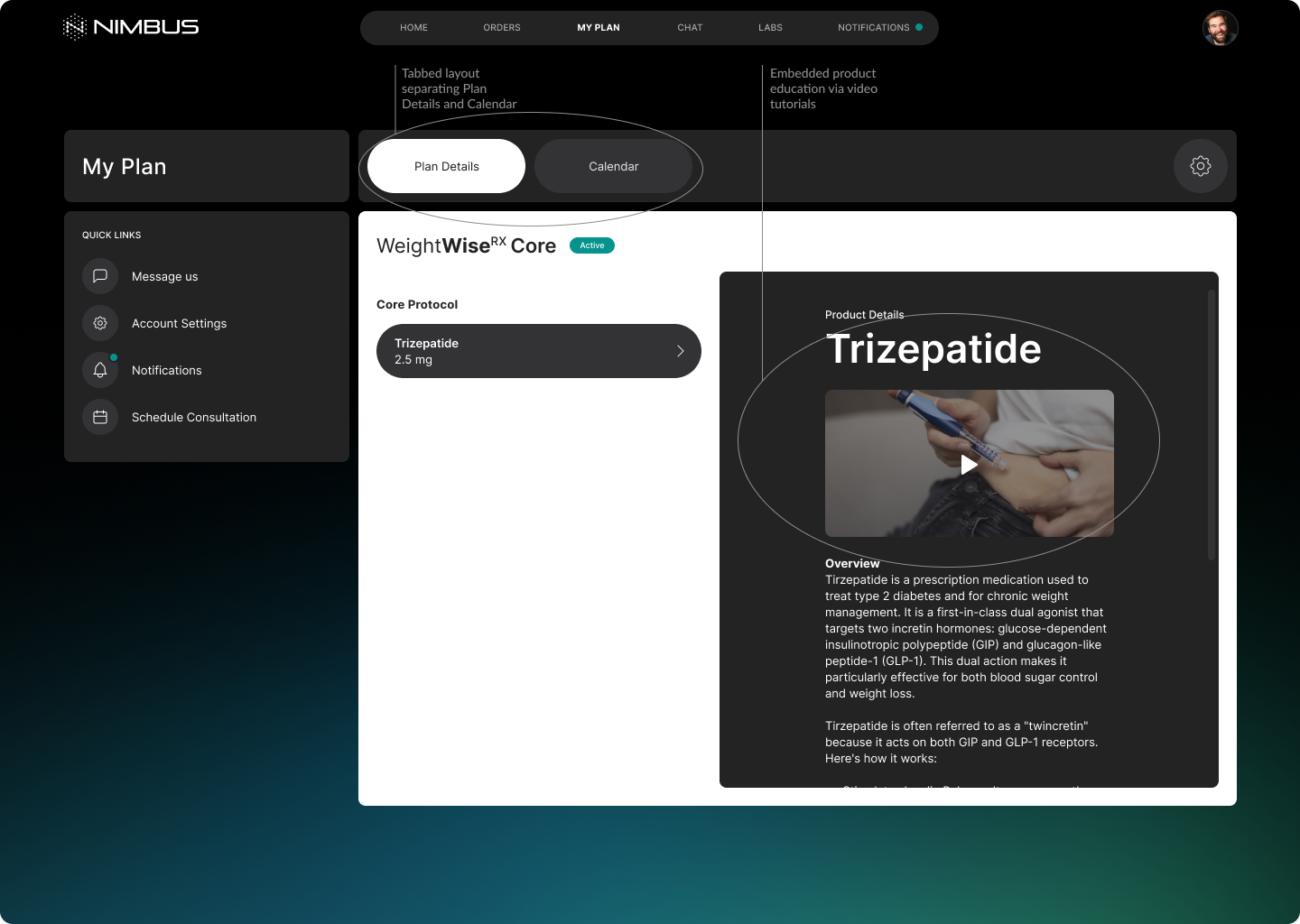
Version 2: Visual & Interaction Redesign
As a longer-term vision, we explored a modern, immersive design system with:
• A dark mode interface
• Tabbed layout separating Plan Details and Calendar
• Embedded product education via video tutorials
• Clearer focus on hierarchy, task separation, and accessibility
Change Management Consideration
Recognizing our long-standing user base, we rolled out changes incrementally:
• Version 1 acted as a low-risk refinement to improve clarity
• Version 2 served as a prototype for internal review and future scalability.
This phased strategy allowed us to deliver measurable improvements without alienating users accustomed to the original layout.
While this project included multiple user flows, this case study focuses specifically on the “My Plans” flow. A more comprehensive walkthrough of additional flows and design decisions can be provided during follow-up interviews.
Final Solution & Outcome
The redesigned “My Plans” flow simplified care management for patients and aligned better with both user expectations and internal operations.
Key Improvements Delivered:
• Clearer hierarchy and labeling: Users immediately understood what plan they were on and what actions were required.
• Terminology shift from “Recommendations” to “My Plans”: Improved clarity and alignment with user mental models and reduced misinterpretation.
• Improved content layout: Presented critical information (dosage, refill frequency, price, usage instructions) in a single unified view.
• Checkout integration: Reduced the number of steps needed to make a purchase, increasing conversion efficiency.
• Mobile-first optimization: Layouts were responsive, addressing the >70% of users accessing the portal from their phones.
Measurable Outcomes (within 6 weeks post-launch):
• Task completion rate improved by 40%, especially for plan review and refill flows
• Support ticket volume decreased by 35%, reducing dependency on manual assistance
• User engagement on the “My Plans” section saw a notable increase in session duration and scroll depth (per PostHog tracking)
These improvements not only streamlined the user experience but also reduced operational burden on the support team — directly contributing to subscription retention goals.
Reflection & Learnings
This project was a fast-paced initiative that balanced clarity, consistency, and business alignment — all within a four-week timeline. While we achieved meaningful impact through incremental UX improvements, there are several areas I would approach differently with more time and resources.
What Went Well:
• Terminology updates and layout improvements led to measurable user and operational gains without disrupting native users.
• A phased rollout strategy helped us manage change effectively across a diverse user base.
• Using PostHog analytics post-launch allowed us to validate the impact of our design decisions and prioritize future iterations with data.
What I Would Do Differently:
• I would have conducted usability testing (moderated or unmoderated) to validate our assumptions and test edge cases, especially for users less familiar with digital tools.
• I would have involved customer support and care coaches earlier in the design process to gather direct feedback from user-facing roles.
• With more time, I would explore content hierarchy refinements and micro-interactions to improve task completion flow and guide the user more intuitively through plan-related actions.
This project reaffirmed the importance of aligning interface clarity with user trust — especially in healthcare. Even small changes in wording, layout, and flow can significantly reduce cognitive load and drive both engagement and retention.
Humanizing technology, one pixel at a time.
Connect with Ikshita
